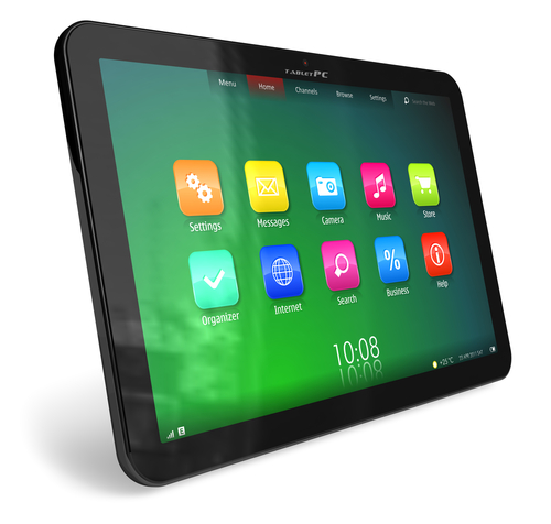
This summer Apple announced it would scrap the “traditional” look of its mobile apps which mimicked real-world objects. This is what is known as “skeuomorphic” design.
What is Skeuomorphic Design? And is it a Good Thing?

Steve Jobs vision for the digital world was that computers should be so simple to use that a complete novice could master them based on instinct alone – that they should be entirely intuitive. So he championed the design of products for Apple where digital elements would look like familiar objects from the real “non-digital” world. This has been adopted widely across interfaces for computers, tablets and smart phones. So “trash” looks like a wastepaper bin, email is represented by an image of a snail mail letter, Apple’s notepad looks like a yellow paper pad and you cut and paste on Microsoft programmes with scissors and a clipboard.
But skeuomorphic design has fallen out of favour in recent times, with Apple announcing plans to move away from using traditional real-world images and many designers looking to ditch this approach in favour of a more minimal approach.
Apple’s decision to move away from skeuomorphic design has split the design world with some welcoming a move away from the use of somewhat forced metaphors to visualise an interface but others feeling that the style of design opened up access to new technology for people who lacked confidence or were unfamiliar computers.
While Generation Y increases in confidence and technological know-how, it’s easy to forget the importance of the grey pound when designing interfaces. Many of the over 70s are still dipping their collective toes into the world of technology and as it becomes increasingly complicated, the need for design clues to aid usability remains important. To assume all users of technology are as confident as those who design the interfaces and have been comfortably using technology for many years seems rather arrogant. I would argue that we should be driven by the needs of technology users rather than our own design preferences.
Perhaps the answer is to look beyond some of the more over-used and hackneyed symbols of skeuomorphic design for more interesting ones, that can still aid a less experienced user in using technology.