Bringing Jewish Neighborhood Voices To Life
Background to the Exhibit
The Jewish Neighborhood Voices project was developed in order to tell the stories of the people who grew up in Greater Boston’s Jewish communities in the first half of the 20th Century. The exhibit consists of oral histories recorded through interviews with people who had lived in the neighbourhoods of Chelsea, Dorchester, Roxbury, and Lynn between 1920 and the 1950s.
Along with the audio recordings, the exhibit would utilise a large amount of photography and archival material to support the stories of growing up and living in these neighbourhoods.
As well as focusing on the four neighbourhoods, the material would also support some key themes of Jewish life during this period. These were family life, neighbourhood life, neighbourhood relations, WWII and the Holocaust, as well as assimilation and upward mobility.
Unique Assets to tell Compelling Stories
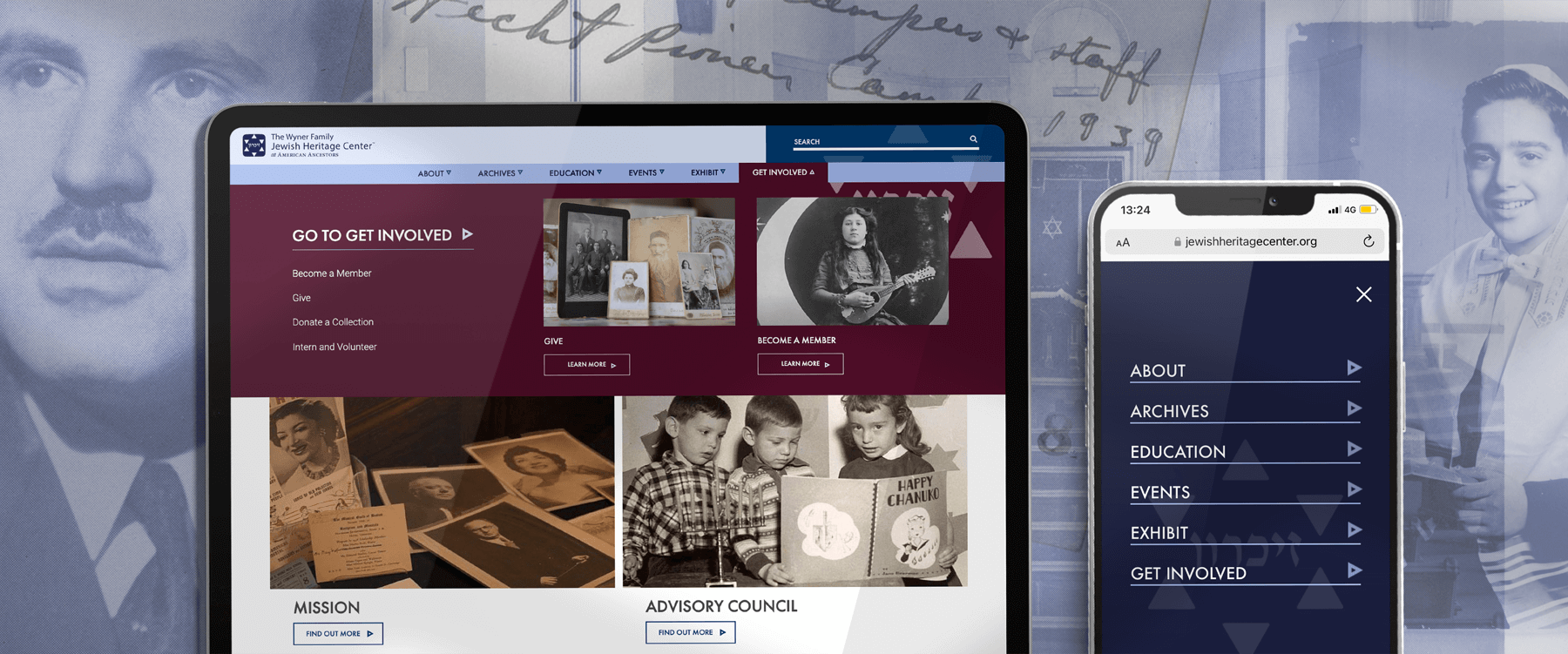
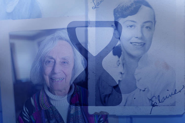
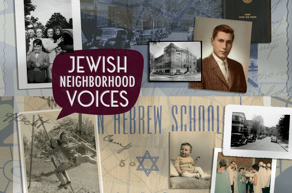
To bring the exhibit to life visually, we created a unique asset style that would make full use of the plethora of imagery held by the Jewish Heritage Center as well as images provided by contributors. The style involved the creation of composite images that used photographs, documents, maps and icons to create images that would evoke the exhibit’s time and place in history.
This style was used to create images that could be used throughout the digital exhibit including hero images, images associated with each of the five themes, the four places, and all the narrators and researchers who made the exhibit a success.
Bespoke Functionality to Support the Exhibit
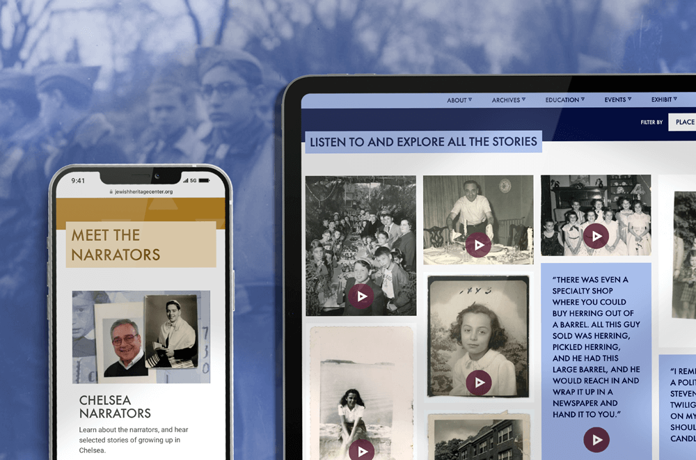
We wanted visitors to the online exhibit to be able to navigate through the content easily, and to be able to filter the oral histories to suit their own specific interests. To provide a maximum level of flexibility it was important that visitors could filter content by place (neighbourhood) but also by theme or even by the person who had provided the oral histories.
In order to provide this flexibility we needed to design and build new functionality that would not only showcase these important oral histories, but would also support this need for filtered content.
Giving the Jewish Heritage Center and its Users Full Control
We scoped a new piece of functionality that would provide a gallery-style view for users. Each piece of audio content would be represented by a card, and would include a relevant historical image or a quote from the audio recording. Depending on where the galleries were placed within the exhibit, users would be able to either filter them by place, theme or narrator.
In order to maximise flexibility, the JHC team could add a gallery to any web page, and select which content, if any, would be pre-filtered. This meant that on a more focused or specific page such as a neighbourhood page, a gallery could be created that would only show the content relevant to that neighbourhood.
Expanding the Multi-site’s Functionality
The large amount of audio content created for the exhibit led to a desire to use media files in all blocks as an alternative to images. This also provided a great opportunity to expand the scope for using audio and video content across any block in the multi-site.
At the same time, we also expanded the functionality around captions. Driven by the large amount of historical images that had been donated to the exhibit, the JHC was keen that all images give descriptive and citation information. We designed a caption approach that would support the addition of captions across all blocks as well as ensuring the site was accessible to all users. Our approach is a discreet symbol, that when clicked reveals the caption, without interfering with the image.
A Collaborative Approach to Content Planning and Upload
In order to ensure the exhibit’s web pages were as attractive, engaging and user friendly as possible, we worked closely with the JHC team in planning and uploading content for the Neighborhood Voices project. By combining JHC’s expertise on the exhibit and its resources with Hookson’s expertise on imagery and creation of attractive page layouts we were able to curate an online exhibit that is thoughtful, informative, attractive and easy to navigate. Working with the team was a real pleasure and we’re thrilled with the end results.
