Digitising the DiCamillo Database

How branding and UX showcased a country house experience and the expert behind it

Website Design and Online Branding for a Cultural Experience Like no Other

Boston-based DiCamillo specialises in organising and leading travel tours focused largely on British architectural and artistic heritage.

Led by architectural historian Curt DiCamillo, the company is also home to an award-winning database of British and Irish Country Houses. Twenty-plus years in the making, and a real labour of love, this growing, unrivalled resource already lists more than 6,000 records.

Added to these are DiCamillo lectures. These informative, fun events see Curt sharing his knowledge of the British Country House, and of associated topics, with captivated audiences across the world.

Building a Beautiful Home on Three Levels

When DiCamillo asked Hookson to create its website design we identified several opportunities to help the company shine online. User experience would be key. This was especially true for the jewel in the crown: that world-class database.

Connected to all that knowledge of course were those tours and talks. The three distinct offerings would require room to breathe.

With these thoughts in mind we began our website design.

Conceiving a Stunning Website Design with Equally Attractive UX

A principal consideration was ensuring DiCamillo’s awesome database was easy to search and experience. With a sizeable and world-leading resource to present, we would ensure every scrap of information would be a cinch to look for and locate.

We also worked hard on uniting DiCamillo’s offerings across one strong and celebratory website design, brand and identity. Ensuring brand consistency across website design was vital. DiCamillo’s clients enjoy and expect refined experiences. The company’s online presence would make good on this promise.
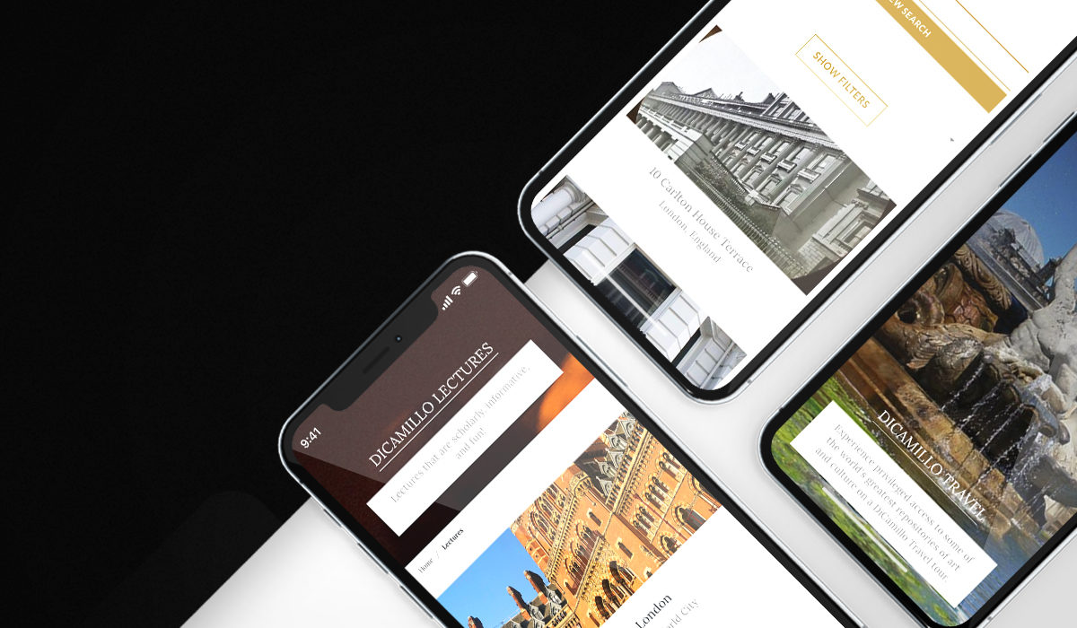


'Hookson has transformed my business and quadrupled the page views my new site receives.' Curt DiCamillo - An Authority on British History, Art, and Architecture.

Elegant design showcased each of DiCamillo's offerings

Bringing Locations to Life Via Standout Website Design

A website with strong and striking visual components was a must. We would utilise the visual opportunities presented by stunning historic locations. To this end, we would employ large-scale photography and bring locations further to life with use of film.

Outstanding UX would also, of course, be key. With three connected-but-distinct services on offer, it would be crucial to offer visitors a clear route to each.

Helping Open the Gates to 6,000+ Country Houses

It was important to Hookson to respect the huge amount of time, research and knowledge across the DiCamillo database.

To this end, and after consultation with Curt DiCamillo, we created powerful search functionality, including an Advanced Search option. Users would then be able to search the resource against assorted criteria.

These ranged from simple keyword searches to the ability to drill down across factors like Architecture, Ownership, Royal Connection and even a home’s appearance on film or TV.

From there, users accessed information, much of it highly detailed and extensive. By providing a robust, but easy-to-use, search feature, we threw open the DiCamillo database to all interested parties.

Accompanying facts and figures, we employed rich galleries of photographs wherever possible.

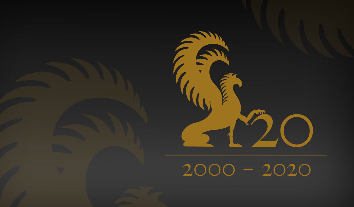
Our commemorative logo treatment celebrated a remarkable milestone

Creating a Timeless Identity and a Brand to Match

As part of DiCamillo’s rebranding, Hookson generated numerous ideas in the area of logo design. One idea flew higher than the rest. Our elegant winning concept featured the mythical griffin, a creature closely associated with British heraldry. This logo, cast in a classic and subtle bronze palette, offered a perfect representation of DiCamillo’s brand values.

To mark DiCamillo’s twenty years in business, Hookson has designed a special commemorative version of the company’s logo. Whilst respecting the regular design, our addition of both the 2000 – 2020 date range, and the numeral 20, draws attention to this milestone and recalls the striking of a commemorative coin or medal. This unique version of the logo will feature across communications during 2020.

A brand is far more than a logo or badge, of course. Further contributing to DiCamillo’s brand identity, we ensured site-wide consistency of tone across design elements and language.

A carefully selected typeface delivered both clarity and gravitas. Scrolling the site revealed simple-but-engaging text panels. These summarised features and offerings. Added to these, friendly calls-to-action invited further exploration and, in appropriate sections, offered detailed itineraries of tours.

Language was elegant and engaging, but never top-down or exclusive. It celebrated the British Country House, communicating excitement and expertise. In short, words across the website perfectly reflected the passion, professionalism and personality of Curt DiCamillo himself.

We united DiCamillo’s offerings across one strong and celebratory website design, brand and identity. DiCamillo’s clients expect refined experiences. The company’s online presence would make good on this promise.

Harnessing the Power of the Picture

The highly photogenic British Country House featured front and centre across our website build. Combining high-quality exterior and interior shots in a huge, widescreen format created instant impact. As well as adding interest and context, we of course selected these images to attract tour sign-ups, and to add to user experience.

Film delivered a whole new dimension too, with visitors treated to a stunning homepage helicopter shot. Use of the moving image continued via a YouTube video which highlighted tour content and activities.

Signposting Services and Features for Smooth Site Navigation

With lots of DiCamillo services on offer, risk of confusion was high. It was therefore vital that users could quickly identify and reach the website section suited to their query.

To this end, we helped achieve excellent user experience by presenting uncluttered paths to DiCamillo’s core services. A simple-but-effective header separated out the offerings. Across an uncluttered menu, we relied on one-word headings: TRAVEL – LECTURES – HOUSES. Our header existed across each site page and section: a consistent and reliable navigation tool.

We enhanced UX also via a tasteful and ever-present footer area. This contained contact information plus links to the company’s visually-led social media channels: Instagram and Pinterest. These highly shareable channels further showcased the houses’ visual splendour and helped pull new website visitors through.

Lastly, a snappy sign-up feature made it easy for visitors to receive news and updates – and for DiCamillo to add to its mailing list.

Visit DiCamillo