Family Planning: Ensuring Awesome Content
Intimately connected with user testing was a deep dive into content inventory planning. Here, Hookson presented users with a detailed view of proposed site content.
To arrive at the most engaging website experience possible our site-planning activities offered options across page content and assets. These included the behaviour and makeup of features like menus and sliders, the design of tools like calendars, and how best to express key content like call-to-action phrases.
Further to this, we presented interviewees with two wireframe options. These visuals expressed potential layout, and user behaviour. They also greatly helped establish user flows – the logical journeys visitors would take.
Balancing Objectives
It was important also to balance visitor objectives – often a single-minded search or event booking – with those of the Society. For the latter, broadening out wider content like membership and donations, publications and projects differentiated it from competitors. As these assets would potentially be of interest to both casual and more experienced visitors, it would be important to give them prominence.
Keeping Content Current – and Corralled
It was crucial that reusable site content was a snap to both upload and update.
Where content – be it videos or calendar events, articles or products for sale – existed across multiple areas of the site, or where they featured on American Ancestors’ sister sites, we ensured management of these assets from just one go-to location. It was now quick and easy to create content just once, then upload and share. This guaranteed that content remained current and fresh across all pages, resulting in a richer UX.
Designed for Lives
From day one, our site-design activity focused on both excellent UX and on reflecting American Ancestors’, and the wider Society’s mission to educate, inspire and connect.
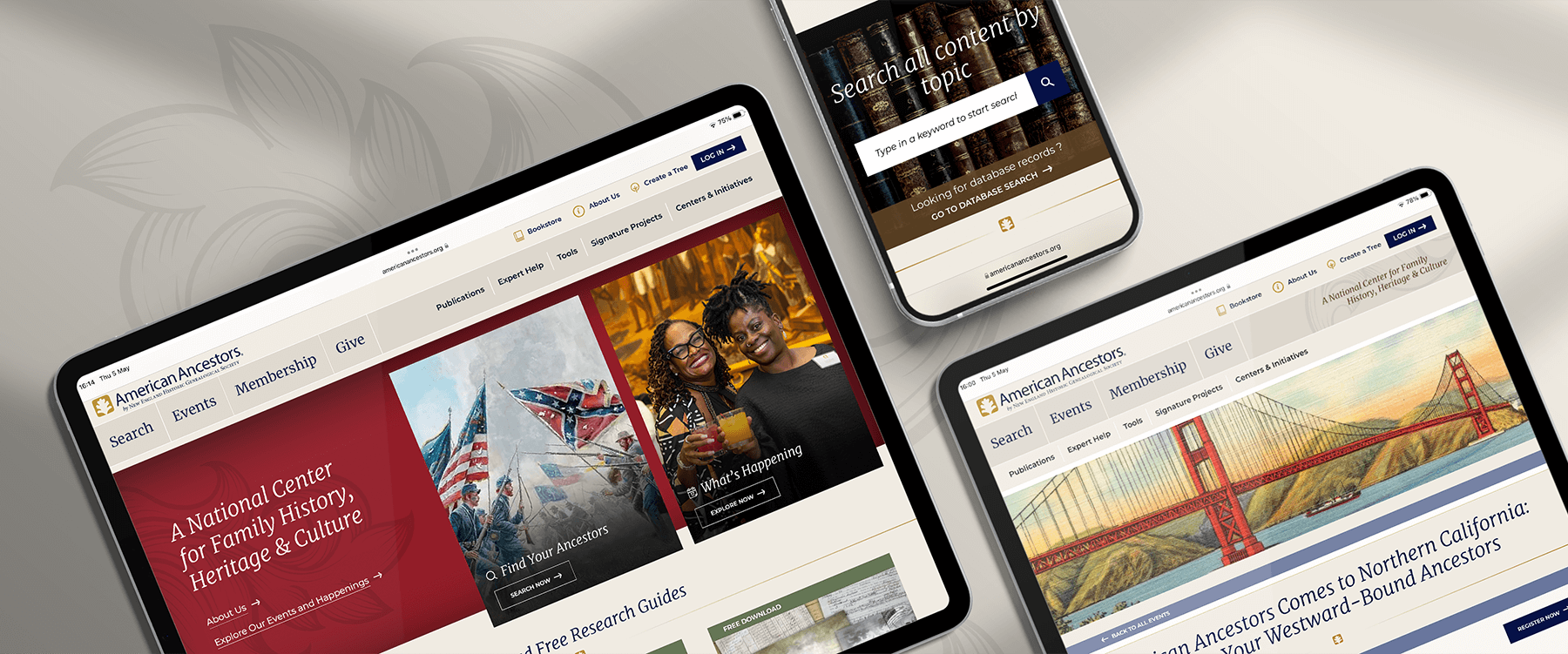
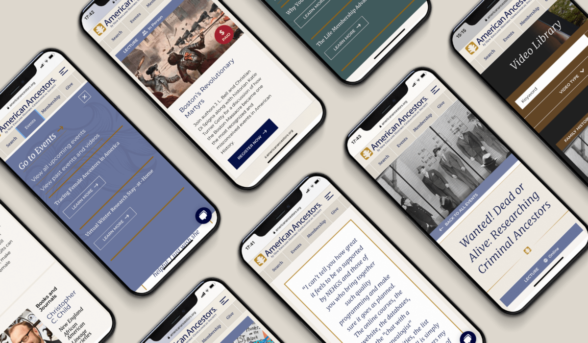
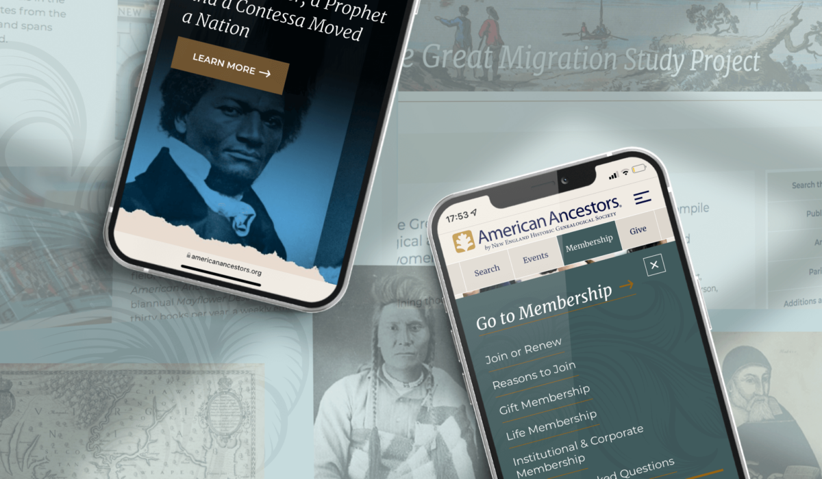
To achieve these we designed a top menu providing simple access to key pages: Search, Events, Membership and Give. Added to these, accessible secondary menus featured drop-downs and ensured clear access to signature projects, site tools and expert help.
Across the site, our colour palette contained a mix of subtle shades. A parchment-like tone provided the principal background for text. Upon this, headlines announced themselves via a classic-looking serif typeface. Body text, meanwhile, relied on a modern sans-serif font.


